
I'm not ready yet...
Hello. This is Dasha's website. I'm still under the construction, so I don't look the way I suppose to be. Lets give her a while to make me perfect. I'm sure she can do it :)
MY CURRENT PROJECT
Here I would like to tell you about the project I'm currently working at. Since it is not ready yet, I haven't posted it into Behance. However, I would like to share the working process steps with you. This way you will have an understanding of how I work.
A while ago, at the unexpected lunch, a friend of mine asked my help with a project. He and his colleague had an idea and asked me to do the UX/UI design for an app. After couple of meetings and discussions, all of us realised that my hotel experience and knowledge are useful as well for the whole concept development. At the early stages we were researching the information and working on the idea together. After that, I've concentrated on my UX/UI tasks individually.
ABOUT THE PROJECT
ABOUT THE PROJECT
The app's concept is to make hotel services easier for hotel guests to order and to make it easier to communicate with hotel, or hotel staff in particular. The idea is to break the communication barriers in hotel services and let hotel guests shape the services.
In the app, hotel guest are able to order all available hotel services with couple of clicks only. They also will be able to find all necessary hotel information and to communicate with hotel staff the most suitable way - through their smartphones. The app will also break the language barrier for guests, whose language skills are not very advance, since the app is going to speak their languages. Hotel staff will benefit as well - there will be no more interactive phone calls and misunderstanding between parties, but all order will come in a proper table format.
In the app, hotel guest are able to order all available hotel services with couple of clicks only. They also will be able to find all necessary hotel information and to communicate with hotel staff the most suitable way - through their smartphones. The app will also break the language barrier for guests, whose language skills are not very advance, since the app is going to speak their languages. Hotel staff will benefit as well - there will be no more interactive phone calls and misunderstanding between parties, but all order will come in a proper table format.
We have started with exploring the competitor apps for a better understanding of what functions are lacking in already existing apps. The most popular hotel chains' apps were researched and then their advantages and disadvantages were highlighted.

USER RESEARCH
USER RESEARCH
Meanwhile, we've also created and launched an online survey about what hotel information people usually search upon coming to a hotel or already being inside, what they request the most often and what problems they face. The survey was pretty much the same as the information we sorted in our lists of observations. We've spread the survey in Facebook and Linkedin. In total, we've received 46 answers, where 29 of them were relevant.
The user research started with defining our potential users - who they are, where they're from, why they travel, how often do they travel. We also had a look at their hotel inquiries - what preferences in terms of hotel rooms, food, services they have, what services they use, what they face the most. Luckily, since me and my friend are working in hotels, it was easy, but a bit timely, to conduct all the necessary data.
Eventually, we had a long list with guests profiles. In a separate list we had collected the problems guests face the most and the list of top requested services. We're collecting these data for a while, until we've got an understanding that the information we've collected
is already enough to move on.
is already enough to move on.
We kept away from the interviews in data research. The main point for that was that there were two of us, who faced potential guests all the time at work and could easily ask necessary information. We're not aggressive at all - when people are checking-out and a receptionist is asking "How was your stay? Was everything alright? Have you used our services X and Y?" these sound more like a nice hospitality gesture, rather than a survey.
Antero, 31
Entrepreneur
Active smartphone user
Travel within Finland and have multiple hotel reservation
Active smartphone user
Travel within Finland and have multiple hotel reservation
Finland
- Needs a parking spot
- Uses gym
- Arrives late hungry: pre-orders snacks
- Wakes up always 6:45
- Needs to print materials
- Uses gym
- Arrives late hungry: pre-orders snacks
- Wakes up always 6:45
- Needs to print materials
Family Cheng
Family travellers, who are visiting Finland for the first time
China
- Needs an extra bed in the room, transportation to & from the airport, and early-check-in
- Speaks English poorly
- Also might need hot water and tea set to the room
- Speaks English poorly
- Also might need hot water and tea set to the room
Elizabeth, 24
Traveller, blogger
Active smart-phone user
Travelling to Lapland with her boyfriend
Looking for a great experiences
Active smart-phone user
Travelling to Lapland with her boyfriend
Looking for a great experiences
Great Britain
- Prefers to have chocolates & sparkling wine on the arrival
- Afraid to get lost in the snow - needs transportation arrangements
- Sleeps long, therefore orders breakfast to the room
- Afraid to get lost in the snow - needs transportation arrangements
- Sleeps long, therefore orders breakfast to the room
We've faced a lot of different categories of people at hotels as well as from the online survey data. All in all, combined all people in the data we managed to highlight 3 categories. Therefore, 3 personas were created according to the categories.
CUSTOMER JOURNEY MAP
CUSTOMER JOURNEY MAP
Customer or user journey maps refer to the scenarios in which the user interacts with the product , to assume and demonstrate possible and current ways of interactions, also from the emotional side.
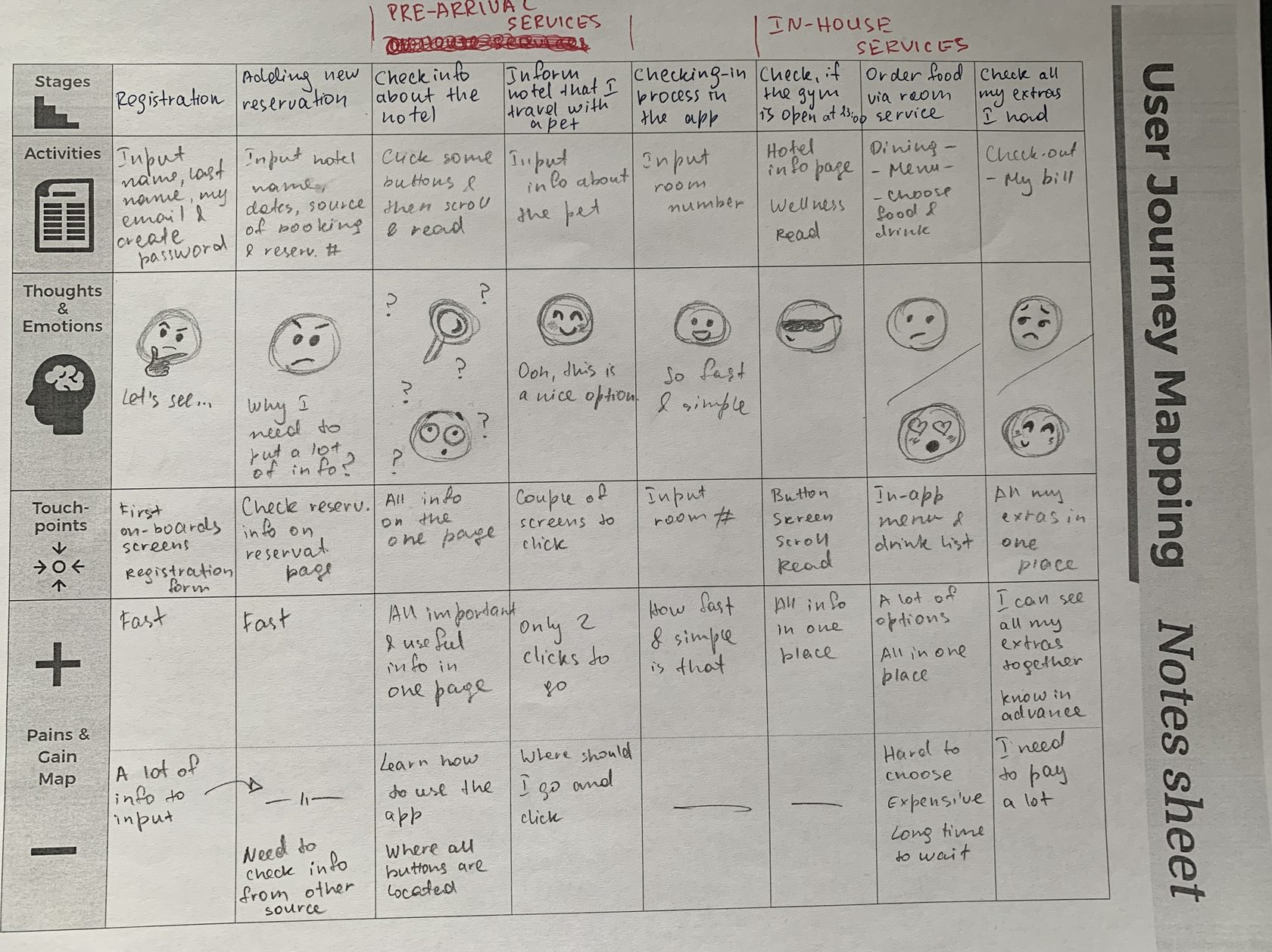
In our case we've divided the whole interaction process into 4 parts: the registration, using pre-arrival services, checking-in, and using in-house services. In every part we've had a look at one to three different stages detailed, highlighting users actions with possible users' points of view and emotional outcomes.
The list with all possible hotel services was created by collecting the existing services from 10 hotels. We're thinking how to group all of them and decided to divide all existing services in hotels into
2 groups - pre-arrival services and in-house services.
After that, all services we had in the list we separated by this 2 groups, but of course, some of them are duplicated in both of the groups.
2 groups - pre-arrival services and in-house services.
After that, all services we had in the list we separated by this 2 groups, but of course, some of them are duplicated in both of the groups.
USER FLOW & SITEMAP
USER FLOW & SITEMAP
I've created user flow in the type of tasks flow. I've concentrated on the main path of the app's flow - from the registration up to the check-out point. This type was chosen because all users will share a common starting point and have no variability on the way.
Therefore, 7 main apps' steps were detected - log-in/registration, adding new reservation, waiting for the confirmation, using pre-arrival services, check-in, using in-house services, and check-out.
Therefore, 7 main apps' steps were detected - log-in/registration, adding new reservation, waiting for the confirmation, using pre-arrival services, check-in, using in-house services, and check-out.
Below you can see the site maps for the app. Since all services were separated by two groups, I've made the site maps division according to that.
WIREFRAMES & PROTOTYPES
WIREFRAMES & PROTOTYPES
I still prefer to start with an old-school way of designing wireframes with the pen and paper. It is fast, intuitive, and flexible for early stage conceptualising.
I try not to use any color while drawing in order to focus more at the skeleton of the system. I also doesn't focus on how beautiful my wireframes are, so they can be messy. I just give my thoughts a freedom to go.
To make it easier for myself to start prototyping, I've collected a mood board for the project at Pinterest. Beautiful photos and illustrations always help to find the right mood and style.
I also like mood board because with them I can illustrate the idea at the early stage and discuss it with a partner/client about how a product is shaped up. Because words can fail in shaping a picture, I trust the visual material to explain my ideas correctly.
I also like mood board because with them I can illustrate the idea at the early stage and discuss it with a partner/client about how a product is shaped up. Because words can fail in shaping a picture, I trust the visual material to explain my ideas correctly.
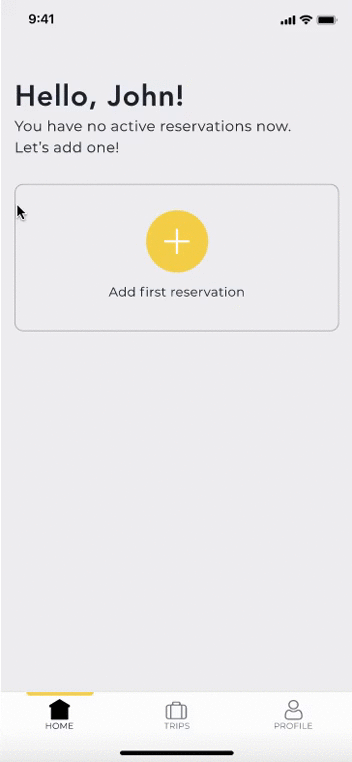
After the pen and paper, I've switched into Figma to draw low-fidelity prototypes there, based on hand-drawn wireframes. After a bit messy drawings, it's time to put everything in order.


When the skeletons of the app's screen were ready, it was time to add some colours. I sticked to the original yellow primary color, which was selected earlier. Even yellow is not a very popular colour, I like such selection because it's a warm and dominant colour, which was also interesting to work with.
Sketch was used at this stage. I didn't want to add a lot of colours, especially at the first stage, because we're creating an MVP and the most important was to have a good app's structure. The UI part of the design will be still improving further.


The very basic interactions were added to the prototypes afterwards. The main aim was to show how the screens are linked and how to navigate within them. However, couple of beautiful animation was added for the true app feeling. There are many many paths the tester can go, which will create a feeling of using the real app.
I've made an interactive prototype in Invision app. This program also has a smartphone app which is very helpful for the future usability testing.
I've made an interactive prototype in Invision app. This program also has a smartphone app which is very helpful for the future usability testing.
CURRENT STAGE
CURRENT STAGE
Presently, I'm preparing for a next step of the process - the user testing. I create various paths and write down the goals users should reach during the test. I also prepare the feedback questionnaire for testers to fill in right after the test.
Both my colleague and I are looking for the potential users. I would prefer to have both face-to-face and online user testing, because these both ways will be relevant. Online testing could be implemented with the help of a program, for example Maze. To start with face-to-face usability testings, I'm thinking of using a Guerilla research technique. The method is to skip the formal participant requirement process and ask members of the public to take part in your research session. The whole thing is very informal and hardly requires preparation.
Both my colleague and I are looking for the potential users. I would prefer to have both face-to-face and online user testing, because these both ways will be relevant. Online testing could be implemented with the help of a program, for example Maze. To start with face-to-face usability testings, I'm thinking of using a Guerilla research technique. The method is to skip the formal participant requirement process and ask members of the public to take part in your research session. The whole thing is very informal and hardly requires preparation.